 iFlipr is one of the leading general purpose flashcard applications for iPhone/iPod which offers interval study and the recommended graded slideshow approach. I see great potential for this application. The clean and powerful web counterpart, in particular, is impressive, and the web centered approach may indicated a general direction for applications in the future.
My review below points out many strengths of this application but also points out some issues with the flashcard interface which will frustrate high-volume students, as well as some of the limits of interval study which will concern long-term students.
Application Name: iFlipr
iTunes Application Link: iCards
Version Reviewed: 1.14
Software License: Commercial (about $5)
Review Date: 2009.01.29
OS Tested: iPod Touch 2.2
Note: This review is from the perspective of language learners, and especially those who will be engaged in high-volume and long-term study of vocabulary. See the Terms page for an explanation of the technical terms used in these reviews. See the Basics page for a list of basic features found in flashcard applications useful to language learners.
The iFlipr iPhone/iPod application is complemented with an online flashcard database at iFlipr.com where, with a free account, users can download shared sets (much like StudyStack, iFlash Deck Library, Flashcard Exchange, and other similar services), create and share their own sets, and freely export sets in the CSV format. However, it might be more accurate to say that the website is complemented with an iPhone/iPod application…
A Flashcard Library Browser?
iFlipr is best described as a “client” of the web page, focused on providing an environment in which a user can download cards and practice them on their iPhone/iPod. This approach has some strengths but also may produce frustrations for and ultimately be too limited for the high-volume long-term student of language. With one exception (ironically the “Downloads” pane) all the panes within the application involve interaction with the website and require an internet connection. That means the very UI of the application is deigned with the online interactivity chosen as the primary focus of the user experience within the application. Instead, I believe it would serve the users better, and serve iFlipr’s chances in future competition with other similar applications, if it focused on the study experience itself, which does not require online connectivity.
The “Featured” pane shows you a selection of high quality sets found on the iFlipr online service. The “Recents” pane shows you recently shared sets, the majority of which I found to be of very mixed quality. The lack of a rating system, at least for the time being means that one faces something of a jungle in wading through the online offerings. The third “Search” pane allows you to search for sets to download, while the “More” pane uses a built in browser to load the iFlipr website and provide access to most of its features. These include the ability to create decks, using a somewhat more basic (compared to the excellent desktop browser experience provided by the website), but still solid input interface.
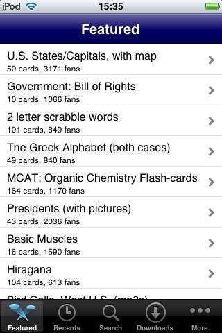
Only the “Downloads” tab is an offline component of the application, listing downloaded sets and allowing you to move into study mode.
The advantage to this approach is easily apparent for any new user to the application. They can easily find and download sets in their field of interest through the excellent interface. They can also, if they have an internet connection, quickly create new sets, or download sets they have created online via the desktop.
However, once you have your flashcard files in the application, however, all of these features become superfluous. Once you have purchased your furniture, you don’t need a whole furniture store camped out in one’s living room, as it were.
I would recommend a complete redesign of the user interface to focus on the study experience. Combine all the online interactivity into one pane of the application. Let users enter that “Online” pane and access all the above mentioned areas such as featured, recent, etc. sets and the ability to interface with the website through the mobile client. That will free up all of these other buttons for greater offline functionality to address some of the problems and missing features mentioned below.
In my interaction with the developer, we seem to have similar views on these issues, and the origins of design of the application are clearer to me after learning that this dates back to the application’s pre-SDK development as a web-based application for the iPhone. I understand that the application is still in a transitional stage and I look forward to seeing how it will change.
Creating and Editing Sets
While it can be done either on the desktop or through the built in browser on the mobile iFlipr client, sets can only be created with an internet connection and, it should be remembered, a functioning iFlipr server. On at least one past occasion, the iFlipr has had connectivity issues, which reminds us that when we become dependent on web services, our data is in the hands of a service provider. In this case it is not a major corporation with dedicated server monitors but a free and well-designed service in the hands of a, for the time being at least, an engaged developer.
One major problem for students of Asian languages or who wish to keep verb conjugation information, etc. in a separate field is that, like Mental Case, iFlipr only supports two fields. Those students will probably want to consider other options like the upcoming iFlash Touch, iAnki, iCards, or other offerings that support three fields or more.
For those who can do with only two fields, however, the browser based set creation is, however, beautifully done. A full WYSIWYG editor is provided in the web based editor which allows you to do a great deal of customization of colors, fonts, sizes, and other formatting.
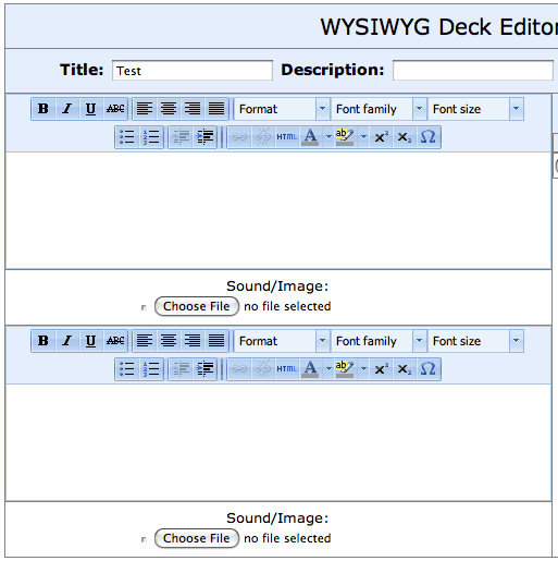
These translate beautifully once downloaded to iFlipr, putting most competitors to complete shame in this area. You may also add sound and images to your cards. What’s more, through the “Settings” tab, one can customize the font and size displayed on the iPhone and the font sizes are done relative to the size indicated through the set creation editor online.
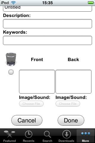
The built in browser in iFlipr also allows you to create sets, but without the rich editor, which is a wise decision. In both cases, however, it is extremely easy to move to the next card. Like the desktop iFlash application, you can simply tab between fields and it will automatically create new cards when necessary. This is in contrast with the awkward Command-N or Command-Return shortcuts required in Mental Case or Anki desktop clients. Creating, editing, and deleting cards is simply a delight in iFlipr. Its dependence on being online for the creation process, however, will be a problem for students who, and I speak from long years of field experience here, find themselves in a grimy dormitory room or hole-in-the-wall cafe in some foreign country without a (or with a very slow) internet connection and want to type up their vocabulary.
There is no way to organize or move cards between or into multiple sets (decks) though the developer has indicated on the Facebook group for the application that groups and folders are in development. There isn’t even, in fact, any easy way to get an overview of what cards are in a set unless one is editing the set through the web page interface. There should, at least, be a way to get a quick list overview of what cards are inside.
Flashcard Study
The heart of any flashcard application is its flashcard study. For the high-volume long-term student even the smallest issues here can be enough to give an elaborately designed application the toss.
There are some aspects about flashcard study that I hope the developer will give serious consideration too. Flashcard study should be fast, clean, and go easy on the hands. Many of us will be studying a hundred or more cards a day so every little moment and movement counts.
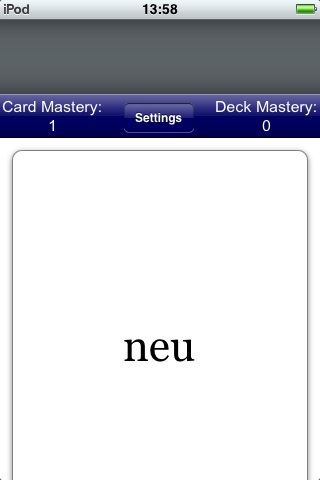
The first problem is the positioning of the buttons. Like many developers to the iPhone/iPod who treat the environment much as it was a desktop environment, they forget that thumb location is key to placement of UI objects. In this case, the very bottom of the screen is the worst location. One must stretch one’s thumb when holding the device with one hand and this repeated motion (over a hundred times, for example) will eventually lead to serious strain. The thumb can reach the upper half of the screen with much greater ease. As I have said in other reviews, the Lima Sky Kanji application approach is good: make the whole card touchable, immediately flipping upon a single tap almost anywhere on the screen. Also, I recommend making a second tap mark the card correct (instead of having to aim one’s thumb at a small check mark) while keeping the “wrong” button as a separate button. As long-term students know, a higher and higher percentage of one’s cards will be marked correct if daily study continues so it should be the default (or easier) choice.
Fortunately, iFlipr does not make the mistake Mental Case does: when marking a card correct or incorrect, it immediately moves to the next card. Well, not actually immediately. There is a slow visual flip animation which ensues. Like I have said in reviewing other applications with this problem, “It was cute the first few times…” but after a few hundred flips it becomes akin to having your computer issue a, once hilarious, barf noise when ejecting a floppy disk (if anyone remembers that craze). This same problem is found in iCards, Mental Case, and some other iPhone/iPod based programs. This seriously slows down flashcard study for high-volume students. At least offer the option of turning these transitions off.
It is also not immediately obvious (until the content is read) what side of a card one is looking at. Mental Case offers a very nice feature of showing a slightly different background shade for each different side. iFlash Touch (at least the current beta version) shows the field name in barely visible text in one corner. Either of these methods, but preferably the first, gives the user immediate visual feedback on what side they are on. This may not seem like a big deal, since one should be able to tell from the text quite quickly what side one is looking at but it can definitely make the study experience more pleasant.
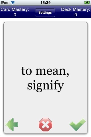
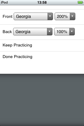
A number of settings are available during flashcard study. Here one can “Reset Mastery Levels,” choose between the graded slideshow and multiple choice approaches to flashcards, of which the former is much better for serious students. They can also choose the order for displaying fields, and whether to use the interval study (Leitner) method or a simple first to last order. It would be best to offer a setting here, perhaps on this very same option, to show the cards simply shuffled. The font and font size percentage (relative to the size set when the card was created) can also be set here in the settings.
This settings window, including the “Keep Practicing” and “Done Practicing” buttons has a very web pagey feel to it, instead of that of an iPhone application but regular buttons. The UI might be improved in future by using more native iPhone controls and following the consistent look of other iPhone applications here.
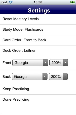
Also, these settings, might better be placed in the settings for a given set, rather than all crammed in settings available only during actual study. These and many other features, such as more statistics, set management, and various other features that might be added later are good candidates for replacing the currently heavy web-interactivity nature of the panes in the home screen of the application.
Cycle elimination exists only to the extent it is part of the interval study process. Like Kanji Flip, the interval study approach is continuous. One never “completes a round.” In order to give users a degree of in-progress feedback on newly studied material, generally I feel it is best to provide a “debriefing” screen after all newly introduced cards have been introduced showing the user, at the completion of a round, how well they performed in the round, before continuing to remove correct cards from the stack. Anki provides this when scheduled cards are completed. There are ways of doing this right without a traditional cycle elimination, but it depends on the effectiveness of the interval study features. Let us take a look at this in our consideration of interval study in the application.
Interval Study
iFlipr immediately puts itself in the running with the more powerful applications when it chose to incorporate interval study, the availability of which is apparent when one opens the “Settings” and sees the “Leitner” method of flashing there by default.
You can see that interval statistics of a sort are being compiled through the “Card Mastery” number. This increases each time you get a word correct and resets to zero when you get it incorrect. I think reseting the word mastery is a suitable brutal punishment for the forgetful and can probably serve well in most circumstances. However, my personal experience over the years of my own interval study suggests that words that have reached any level higher than 4 or 5 that one gets wrong after many weeks or months without being prompted to review it, recover very quickly and once they have recovered don’t need to be reviewed as frequently as a fresh card at a mastery of 0-3. I thus think an optimal system is one which drops the mastery level by some number (or provides such an option) perhaps arbitrarily set by the user according to their own needs (with a default of a drop of 2 or 1 point of mastery).
The “Deck Mastery” number, which shows the lowest mastery of any card among those in a set is not a useful number and I would recommend replacing it with a more useful statistic (See the stats section of my Basics page for some possible replacements). Words are not all created equal. Not only do we find some more difficult to memorize than others, we also unconsciously prioritize all words we learn according to how useful we deem them to be. The only exception to this is in preparation for a vocabulary examination in which the probability of a given word being tested is equal to that of all other words on a vocab list but the many language programs I have gone through suggests that students quickly learn that this is usually not the case. If my set contains 100 Chinese legal terms, for example, and I have real difficulty in remembering 2 very obscure contract terms that I’ll probably never have any use for, Knowing how well I know (on average, for example) the other 98 of them is far more useful than how much I suck on two words I’ll never use but am too lazy to delete from the list.
The actual algorithm being used is not transparent to the user or even posted on the web page. Interval Study in software applications has been around since Piotr Wozniak designed SuperMemo for DOS in 1987 and I designed Flashcard Wizard for Mac OS 9 in 1999. The maturity of this approach, which all the most powerful applications now include, is such that developers could benefit from exposing their algorithms (at least in general terms) for advanced users of flashcard study to help guide them in their purchasing decisions.
The iFlipr developer Joseph Kumph is, however, open about it and was kind enough to explain to me how it is done in the case of iFlipr:
The algorithm is fairly simple: cards in the deck are broken up into different groups based on their card mastery level, and one of these groups is choosen based on an exponential decay function coupled with a random number generator. Specifically, the cards with the lowest card mastery are the most likely to be choosen. There is also a “ghost” pile, where a card goes immediately after it is marked incorrect, and kept there for about 30 seconds, to make sure the cards are not shown again too quickly.
There are a number of good elements at work here. The use of a “ghost” pile is an excellent advanced feature that will be familiar to Anki and Mnemosyne users. The iFlipr approach also guarantees that for large sets of cards, a user will be more likely to be prompted with unfamiliar words before more well-known ones. However, iFlipr has a very serious case of the Insatibility Flaw since it continually drags out words which are not on the verge of forgetting. I hope that the developer will revisit his interval study approach and develop an algorithm which focuses as much as possible on only prompting those words in need of review (with an optional study on demand feature for crammers).
It doesn’t seem that, as in the case with synching iAnki, Mental Case, or some other powerful iPhone applications, that interval study data is synched with the server. That means if you practice your flashcards directly through the web interface, this study has no connection to whatever progress has been made on the mobile client. Given the tight integration between the mobile iFlipr client and the web page, I find this somewhat unusual.
Other Comments
There are a few UI issues with iFlipr which may be easy to fix. Much of the application feels more like a web page than a native iPhone/iPod application. Double clicking (by mistake) ends up slightly zooming the “page” which shouldn’t happen. The panes should be solid and stick in place, but instead one can often accidently “drag” the page out of position or find it out of position when a new dialog set of options appear:
These are very minor UI problems I think can be addressed without too much difficulty.
It is fantastic that data is completely portable in iFlipr, through its online interface. There is excellent import for CSV and tab-delimited data and it will also export CSV data (without formatting data, except for for carriage returns).
The support page for the application is essentially through Facebook. Here the Wall shows that the application has some very enthusiastic fans. However, though facebook is popular, contrary to common perception, not everyone on the world is on the site yet. I would recommend providing some support interface or forum outside the environment of Facebook.
Fool’s Final Words
iFlipr is a clean and strong contender in the iPhone/iPod flashcard application market. The web interface is clean, simple, but powerful, and provides an easy way to download one’s data. However, there is too much dependence on the web interface and the client ought best gather the web interactivity options in one place to allow for gradual expansion of other useful features, especially in the realm of set management, study statistics, and so on.
As explained above, biggest issue for long-term students of the application is the Insatiability Flaw in its interval study approach. The biggest problem for high-volume students is the UI of the flashcard study itself. I thus suggest further refinements in the algorithm to eradicate this problem, and possibly provide filters for truant users to easily return to study while prioritizing words with certain tags or at certain interval stages.
The slow visual flip transition is cute the first few times but slows high-volume study significantly. I have also not tested performance of the application with the high-volume sets (3000-8000 words) that students in intensive language programs will want to subject their software to. I was not comforted by suggestions on the support page to keep it to 100 words per set. The lack of full touch-ability for the card and the hard to reach buttons in the bottom of the screen should be given a second luck in future releases.
Finally, support for only two fields will mean that students of Chinese, Japanese, etc. will want to look elsewhere for a more flexibility three+ field solution.
There are some real gems in this application, however. With some improvements here and there to address the issues above, I feel like this application could easily catapult itself to the top of the pack.
Import: Tab-delimited and CSV.
Export: CSV.
Non-Roman Scripts: No problem
Modes of Study: Graded Slideshow
Media and Frills: Images and Sound.
Entry Creation: Excellent if two fields are enough.
Entry Editing: Excellent
Set Organization: None.
Flashcard Study: Poor UI, slow
Interval Study: Fair, Insatiability Flaw
Formatting: Excellent
Design and Feel: Fair, could use some improvements
Statistics: Poor
Golden Coxcombs: 6/10 but with great potential…
12 Comments
I’m not going to comment on iFlipr, because it’s a competitor to my program, Mental Case, and that would be bad form.
I do take exception to some of the conclusions drawn, and in particular some of the recurring themes in these reviews. The problem is that the reviewer is claiming to be the last word, and is not recognizing that other users are not necessary the same way inclined.
Two examples spring to mind: use of animation in the interface; positioning of buttons on the screen. In neither case is there an absolute measure of what is best, but the reviewer is claiming to possess such a measure.
Use of animation gives subtle feedback to the user. A flip, for example, is used by most flashcard apps to tip the user that they are moving to a new side of the same card. A slide is usually used to mean you are going to a new card. Very useful, not over-the-top ‘eye-candy’. You’ll see this approach to animation used in more and more apps in the future.
The positioning of buttons on the screen is even more contentious in my view. The reviewer claims it is more difficult to reach buttons at the bottom. I think this is very much user dependent. I find it a stretch when using my iPhone one-handed to reach the top of the screen. The bottom is easily within reach. So to claim that it is a fact that the bottom is harder to reach than the top is going way to far. It is a personal observation, and will differ from person-to-person.
Drew McCormack
Mental Case Developer
Hi Drew,
I’m sorry that you are disappointed by my reviews. I have tried hard to be fair in these reviews, but not to pull any punches. You have on numerous occasions said that I write my reviews to “claim the last word” but I don’t see things that way.
I created this website because I believe I have a good deal of knowledge and experience in the use of flashcards to complement language study. As I state at the beginning of this review, “This review is from the perspective of language learners, and especially those who will be engaged in high-volume and long-term study of vocabulary.”
From that perspective I have made certain claims, which I usually try to back up with arguments when I feel they are not obvious. To the extent that I believe that what I say is true for most language learners, and not merely a matter of personal preference, I am “claiming to be the last word” but I am always open to counter claims and counter arguments and should feel no shame in changing my views when I am shown to be mistaken.
In response to your two points, I believe this is not merely a matter of preference. I don’t think it is “contentious” in that I believe these the following to be the case:
1) I have nothing against “subtle feedback” but concede only marginal usefulness for the feature. It goes from a marginally useful visual signal to being a problem as soon as it has a measurable impact on the students I aim to target as the audience of these reviews.
A momentary flash of the screen, an extremely fast flip of the card, these are subtle. However your flips, and those in iFlipr and several other applications are not subtle and they are not fast. I am writing from the perspective of language students who will most likely have to flip several dozen to over a hundred cards for a total of over a hundred repetitions including cycle elimination. When I am reviewing cards that I know well, your flips take about the same time it takes for me to decide whether I know a card and tap the correct button. In those cases the flips are actually doubling the total study time. That is not “very useful” – that is a serious problem and a waste of the student’s time.
2) I don’t believe my claim about the positioning of the buttons on the screen is contentious, Drew. I really don’t. Although I have not conducted a formal study, and if such a study proved me wrong I will humbly repent, I think such a study of a statistically significant set of users would prove what I think is common sense in this case:
Hold the iPhone/iPod in either hand in the most natural and stable position (so the device will not easily fall out of your hand while walking etc.) Now, swing your thumb without stretching it significantly. Depending on whether you are holding it in your left hand or your right hand, I believe a large empirical study would show that a very significant majority of thumbs stretch from the top corner of the screen nearest their hand to, depending on the natural flexibility of the user, somewhere in the middle of the screen. I think (and again, by all means prove me wrong) an empirical study would show that a) to reach the bottom 1/6 of the screen on either side (or its average) requires significantly more muscle stress and stretching than the average stress reaching the top 1/6 and it could show b) that to hold the iPhone/iPod to a position in (the average sized) hand where reaching the bottom 1/6 does not cause significantly more muscle stress, it requires the balancing of the iPhone/iPod far more precariously, subject to easy dropping and also greater total stress on the hand due to the greater weight of the device being concentrated on the fingers holding it in place.
Until someone gives me reason to believe otherwise, I continue to claim: the location of these small buttons at the bottom of the screen is bad user design because touch screens are not computer monitors – ergonomics matter a lot more, and they matter most of all when you are are prompting users to engage in a highly repetitive activity. I continue to believe the best way to deal with this is reduce the number of movements/buttons needed as much as possible and when you need them, make the whole screen accept a single tap or place buttons somewhere in the upper half of the device screen (ideally providing a way to customize left/right location for optimum comfort if it is located in an upper corner).
Firstly, Konrad, I’m not disappointed in your reviews. They are very useful. That was not the intention of the post.
I just wanted to point out that in some cases you take the high ground, where you really cannot claim it. The iPhone holding issue is one such instance. It is your opinion that the top is easier to reach, but it is no more than that. It’s an opinion. To the best of my knowledge, you have no scientific arguments for this, other than the rational that you have presented. But that still doesn’t constitute a ‘proof’ of any sort.
I’ll give you the counter argument: most of the time, the thumb is busy at the bottom of the screen when using the iPhone. For example, when you are typing, the keyboard is at the bottom. So most users hold the phone in such a way that they can type at the bottom, or hit toolbar buttons, as required. So I suspect what you say is true of how you hold the phone, but not true of how the majority of people hold it.
For example, when I use the iPhone one-handed, I type place my little finger under the bottom edge. That way my thumb can easily type and hit the bottom. It is actually more difficult to reach the top like this, and that is why I say it depends how a user holds their phone.
Incidentally, Mental Case, and most other iPhone flashcard apps, allow you to tap or swipe to navigate. Mental Case actually assigns areas of the screen to navigation: you can hit the right or left of the screen to move forward/backward. This does away with the top/bottom issue all together.
Sorry I may have seemed to come on strong. I just wanted to point out that some of the issues you bring up are your opinion, and not set in stone. Your tone sometimes leads one to think we are dealing with facts, when it is not always the case.
Drew
This review really articulates a lot of what I was thinking about iFlipr. I love the program and it has already helped me immensely, but it certainly has room for improvement. Like you said, the flipping feels too slow and I never understood the point of the “deck mastery number.” I didn’t realize it was connected to “Leitner mode” until now, since I didn’t even know what Leitner mode was. Anyway, good review, and I hope some of your feedback is incorporated in future versions.
I use iFlipr all the time and it is excellent for study over the short term. What’s lacking for me it a long term study interval system. I want something that understands the difference between short term memory and long term memory.
Once an item is in long term memory there needs to be some mechanism that creates a study curve over increasing time intervals (ie 1 day later, 2 days, 1 week, 1 month, 6 months, 1 year etc) I currently have maybe 40 different card sets of different sizes, and I have no real sense of when I last studied a particular set, or if my memory needs to be reactivated with respect to that set.
Also the organisation of sets is very clumsy – they are simply placed in alphabetical order. I’d like some sort of filing system so I can link sets together.
Also a system for shifting cards from one set to another would be useful, or if iFlipr itself could created a daily study set based on previous study success/failure or it’s own predictions about which cards need to be studied based on expectations of forgetting over time.
In addition to my previous comment:
There is a way to deal with the cycle elimination problem by reviewing the set in ‘first to last’ mode and using it to reset the card mastery count for those card that are causing problems. Switching back to Leitner mode these cards will now be at the ‘front’ and can be reviewed in a focused way without the interference of well memorized cards. This works particularly well for larger sets (say 1000 cards).
For more than 2 fields it’s possible to create the fields in excel and then use excel’s string handling functions to create 2 fields that combine the source fields in the way one needs them (introducing html tags for formatting if needed).
Just ran across this review and I have to say that I agree with most of the points made in the review, esp the flip animation. Can’t imagine that it would be too hard to have the option to turn that off in the menu. I am currently using iflipr to learn 2000 Chinese characters. Ideally I would like to see two fields on the front (one for a traditional and simplified characters) and two fields on the back (romanization and definition), so what Mark wrote is intriguing. I have all I need in an excel file but I don’t know how to use string handling. Can you show an example Mark?
I figured it our if anyone wants to know you do this =A1 & “” & B1 This will merge the two cells together and make a line break. This works on the import function of iflipr.
It took out what was in the quotes it should be =A1 & “” & B1 without the spaces between the Hope this helps
ok that didn’t show either. in the quotes just put in the code for a line break in html.
Thanks for the review. Still trying to find a flashcard program that is not connected to web at all because it’s for my kids on their iTouches (which have monitored web usage). Maybe Mental Case does? I also read the discussion about screen real estate for buttons and think you’re both wrong, haha, just kidding, but in all honesty, the easiest area for me to access with my big hands are mid screen, low buttons cramp my thumb and high ones are a stretch. However I don’t think it’s a good graphical place for buttons… How about user defined!!! This would be the best bet for positioning and animation, no?
Nice and accurate review.
I’m adding some comments, although the thread is stale, because it was this review which tipped me towards trying the app.
I find the export of data a serious weakness as it loses formatting (including new-lines). For example if one exports a set and then imports them they will not look the same – the text will all be on the same line. This makes it non-portable and in itself is reason to look for an alternative.
I found the Interval Study (Leitner mode) to be an annoyance as my cards require some thought when answering (e.g. name 8 properties of X) – if I got an answer wrong it would usually be re-displayed on the next but one flip because the recycle period is just 30 seconds.
A plus point is the ability to enter cards via the web-interface using a regular keyboard.
I hold my iPhone in my right-hand such that it rests on my little finger. In this position I can reach the bottom and right-hand side of the device easily. The hardest part to reach is the top left-hand corner. So for your empirical test include me with Drew. He makes a good point about the keyboard being at the bottom of the screen in apps that use it.