Mnemosyne is a very lean and straightforward flashcard application created originally by Peter Bienstman with powerful spaced repetition options. It is open source and written in Python with the Qt user interface libraries making it, together with Anki, one of the rare cross-platform flashcard applications currently available. Mnemosyne uses a graded slideshow method, cycle elimination and supports two or three fields on each card.
Mnemosyne is quite limited in its features, but its open source status, its sheer simplicity and the strong focus on the core task of spaced repetition makes it a strong minimalist offering for students of language using windows and Linux, and with the recent appearance of a binary download for OS X, Mac users can now also use the application without having to go through the incredibly complicated source building and installation process.
Application Name: Mnemosyne
Version Reviewed: 1.0.1.1
Software License: GNU Open Source
Review Date: 2008.06.29
OS Tested: Mac OS X 10.5.3, Windows XP Home SP2
Note: See the Terms page for an explanation of the technical terms used in these reviews. See the Basics page for a list of basic features found in flashcard applications useful to language learners.
The features described below, as far as I can tell, work the same in the Windows and Mac versions. I have not tried the Linux version. My tests on the Mac version is based on the binary found here and suffers from some user interface defects described below.
Creating and Editing Entries
The program opens up into a simple central window. You add cards by pressing the add card button and then can move through the fields of your new card with the tab key. Once you have entered the information for the flashcard, you choose an initial interval stage for your card which establish whether you already know the card or not.
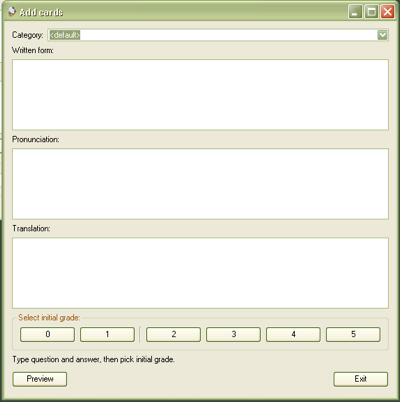
You can assign a single category to your cards, which are useful for sorting them later. You can also “activate” and “de-activate” categories, so that you temporarily stop studying some words. This is the only equivalent for organizing your cards, but like a similar feature in Anki, leaves something to be desired. The set/case organization based approach of Mental Case and iFlash is, in my opinion, superior. The fact that cards cannot have multiple categories is also frustrating.
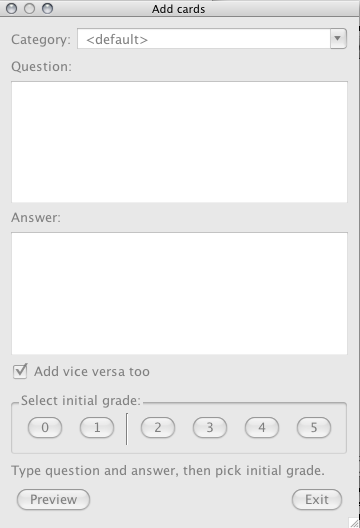
When you create a card, by default, a second card is created which reverses the order. This makes sure that you are tested in both directions when you study. It would be nice to be able to turn off this feature, since not all of us want to study words in multiple directions if we are focused only on reading ability, or in production. In fact, strangely you can turn this feature off in the OS X version by unchecking “Add vice versa too” but I didn’t see a similar option on the Windows version.
UPDATE: The developer tells me that this option is also present in the Windows version. If you don’t see it, trying uninstalling and reinstalling the application.
One of the features which some people, such as myself, will find annoying while others will see as an attractive preservation of a clean and uncluttered interface is that many features of Mnemosyne are hidden from view in contextual menus and only accessible with a right-click. This is bad user interface design, even if some users will not mind it. If you right-click in a new card you get options for “Insert Image” and “Insert Sound” (I have not tested these features). This is also how you switch from 2-field to 3-field cards.
Mnemosyne does support 3-field cards, a must for Asian languages, but the three field support is weak and not well thought out. When 3-field cards are listed in the “Edit Deck” mode, the third field is not listed in its own column and you can’t sort by the field. Also, when you create a card, by default, a second card is created which reverses the order. This makes sure that you are tested in both directions when you study. With 3-field cards, however, there are still only two versions of each card created.
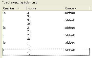
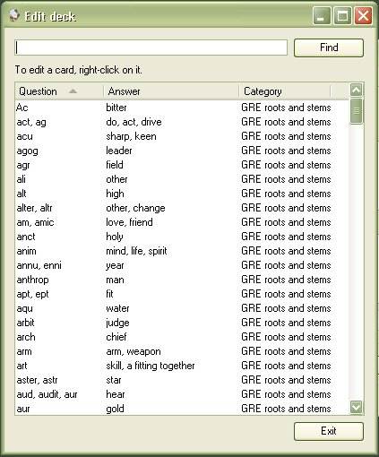
Once you have cards in the deck, you can click the “Edit Deck” button to get a list of your cards and edit them with (again) a right-click on the item in the list.
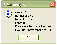
You can also get statistics for individual cards through another option in the right-click contextual menu but one wonders why some of these statistics are not shown as a column in the overview, where it would be sortable.
Import Features
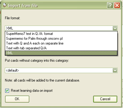
Mnemosyne supports an excellent variety of import formats, included tab-delimited sets and SuperMemo which makes it easy to bring in new card sets, some of which are available for download from the project’s homepage.
Reviewing Entries
As soon as you have a collection of words, any time you boot up the application Mnemosyne prompts you to begin flashcard study, showing you the words it guesses you need to study. You respond to each card by indicating a number from 0-5 depending how well you know an entry, with 0 corresponding to not knowing the word at all or higher numbers if you have greater confidence. The application uses cycle elimination so you will be prompted to repeat words you didn’t know until you give it a higher score.
You don’t have to learn all unlearned words in the program and any time you boot the application it will first prompt you to review those scheduled words among those you have learnt before giving you the opportunity to continue studying as yet unstudied words.
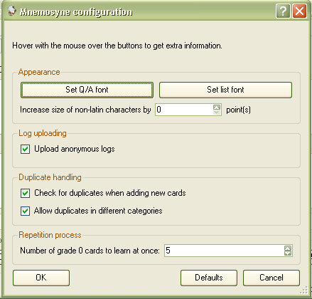
The preferences offer the ability to control text size of cards, and can optionally boost the size of non-latin characters.
Interval Study
Mnemosyne uses an excellent form of spaced repetition similar to Anki and an earlier version of SuperMemo. Words come in 5 stages and the application keeps track of lapses and an “easiness” attribute. The process, also like Anki and SuperMemo is not very transparent, and unlike some other flashcard programs out there, there is no way to customize the process. You can’t sort words by their stage or easiness, and I don’t think it is even possible to reset the stage of the words. Some would argue for a “just trust in the application approach” but as someone who has designed a program with much more flexibility and currently uses another one which allows for such flexibility I must say that the freedom to control my own interval study, within limits, is rewarding, especially over the long term when the number of cards involved is very high.
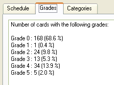
Mnemosyne does let you see a limited number of useful statistics including the percentage of cards at various stages and, much more useful, a list of how many cards are coming on which of the upcoming days.
Mac OS X UI Problems
After several hours of trying, I was never able to successfully build a version of Mnemosyne on the Mac from the source using the instructions on the homepage. This kept me from being able to try it natively in the Mac environment for some time. Now that there is an easy binary download of the application, we can use the application as well but, like its more powerful rival Anki, it feels very much like most cross-platform applications that were not designed with OS X directly in mind. Design matters, especially when you use an application every day, and the idiosyncrasies of non-standard behavior and appearances can become grating.
The toolbar in the main menu is classic windows toolbar, the disabled buttons seem uglier in the Aqua environment of OS X. These are minor issues but a reminder of what operating system was in the mind of the developer when the program was designed. More annoyingly, the add card window is a palette style window and yet strangely modal, not allowing clicks outside it. Like other palettes, however, it disappears when you switch to another application.
There is also a frustrating visual issue in the current build. Anytime a window is opened, all controls on the window are dimmed, even though it is the active window, and you have to click once somewhere within the window before all controls suddenly become active again.
While the UI works on the Mac, it somehow doesn’t feel as sleek and simple as its counterpart on Windows. While looks really shouldn’t matter, coupled with the annoying clicking problem and the strange behavior of the modal-palette, it will probably annoy enough users to send them to another application.
Fool’s Final Word
Mnemosyne’s biggest asset is its clean simple interface, which looks especially good on Windows when compared to many competitors. It feels very lightweight but actually hides a lot of power under the hood. It should serve students well for long term language study, especially if they don’t need solid handling of three field cards. At least one online review compares it favorably with Anki, but if you want a powerful cross-application program which focuses entirely on interval study, it simply can’t compare.
If you use OS X, want flexible control of your interval study, set management, or a wider feature set, other applications have much more to offer, but for many, especially on Windows, this serves as a very easy to use introduction to the world of spaced repetition. You certainly can’t beat the price.
Import: Multiple formats
Export: XML and tab delimited
Non-Roman Scripts: No problem
Modes of Study: Graded Slideshow
Media and Frills: Images, Sounds (not tested)
Entry Creation: 8/10 (keyboard input not remembered)
Entry Editing: 2/10 (no editing of cards directly in list view or during review, all options by right click, bad handling of three field cards)
Set Organization: 3/10 (No set management. Single category can be assigned words, which can be activated or de-activated for study)
Flashcard Study: 9/10
Interval Study: 9/10 (Can’t be customized)
Formatting: 3/10 (Can change font sizes)
Design and Feel: 7/10 Windows, 3/10 OS X (Far too much use of right-click for options. Nice clean interface in Windows but serious UI problems on OS X)
Statistics: 6/10 (You can view grade statistics, and upcoming words, but can’t sort cards by them or view them in column view)
Golden Coxcombs: 6.5/10 Windows 5/10 OS X
Other Substantial Reviews
5 Comments
You were actually correct in your review, the windows version DOES have a bug concerning the “add vice versa” option.
If you use 2-sided cards, the option is there, it disappears when you go to 3-side cards. Reinstalling does NOT fix this problem.
Thank you for the reviews of flashcard software, and especially the iflash recommendation, which I’m downloading now, despite the fact that you have not yet reviewed it. Based on what you’ve written about others, I trust your recommendation, and the price is right! Though price wouldn’t matter if I couldn’t find an intelligent recommendation because I’d rather spend more moneythan waste time trying something that gives me headaches. Although I’m trying it now, I’ll still look for your review of iflash. It’s very hard to find good information on software on the web, so I’m very grateful for your work reviewing these. I really need this kind of program.
provoc well-deserves a mention
> The fact that cards cannot have multiple categories is also frustrating.
This is supposed to be fixed in 2.0, which will be released… this year. Probably.
> The process, also like Anki and SuperMemo is not very transparent, and unlike some other flashcard programs out there, there is no way to customize the process. You can’t sort words by their stage or easiness, and I don’t think it is even possible to reset the stage of the words
Plugins. I’ve used the ‘randomize order of reviewed cards’ plugin, and the ‘review by category order’ plugin.
As well, I still use the plugin which displays the current card’s status in the bottom status-line.
I have recently come to know about the Mnemosyne software and have just started using it. Can anyone tell me, how I can write Kanji on Mnemosyne to make Flashcard
2 Trackbacks/Pingbacks
[…] Here is a very long and detailed review of Mnemosyne. […]
[…] study as well as an interval study approach similar to that provided by Supermemo, Anki, and Mnemosyne. The developer posts some interesting comments on interval study (spaced repetition) on the site […]