iCards is a flashcard application for the iPhone and iPod touch that offers the graded slideshow method of study. It offers the ability to study with cards in random order, add and edit cards in a set, and supports three fields per cards which is useful for many language learners.
The installation of iCards comes pre-loaded with Japanese vocabulary (JLPT) and Japanese Kanji character cards (常用漢字 grades) but allows you to and manage new sets.
While this very reasonably priced application has a number of great standard features, serious students of language should probably consider some of the somewhat more expensive alternatives available. The lack of cycle elimination is especially problematic, while the lack of interval study, or reversal of field order compares poorly with other competing applications. The user interface during card study also could benefit from some further improvement.
Application Name: iCards
iTunes Application Link: iCards
Version Reviewed: 1.2
Software License: Commercial (about $1)
Review Date: 2009.01.27
OS Tested: iPod Touch 2.2
Note: This review is primarily from the perspective of language learners. See the Terms page for an explanation of the technical terms used in these reviews. See the Basics page for a list of basic features found in flashcard applications useful to language learners.
This graded slideshow flashcard application comes pre-installed with vocabulary and kanji flashcards, students of the Japanese language can immediately use it for their study. Other users will have to add their own cards.
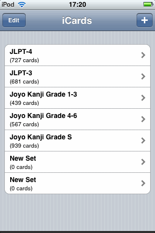
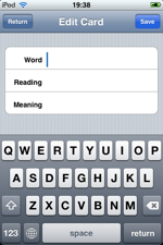 Sets of cards can be created, deleted, and studied in an easy to use and familiar flashcard application environment. All sets are available directly from the home view. All cards, which can also be easily edited and deleted, come with three fields, which is useful for Asian languages or students who want additional data on their cards. Users needing only two fields need only leave one of the fields blank and iCards will recognize the fact and size the fonts of the two fields accordingly during study.
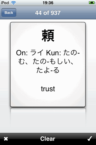
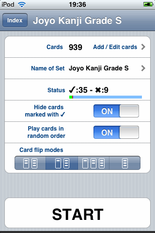
Study of the cards can be randomized, but the order of the sides shown cannot be likewise randomized.
There is the option to choose between four different “card flip modes” which give the option of showing only one, two or all three sides. Strangely, however, there doesn’t seem to be a way to determine which of the three sides one wants to start with. Thus, if one ones to study from English to Japanese, for example, that option does not seem available. That is an unusual omission and a more important feature than allowing users to optionally show the second and third fields at first showing of a card.
Flashcard study on the application is accomplished by finger swiping through the cards and marking them correct or incorrect. The correct/incorrect buttons are very small and located in the bottom of the screen, which is a bad stretch for the thumb when holding the iPhone/iPod. This makes any major use of the application a strain on the hand. Also, three other interface issues that might be noted is 1) the unusually large and distracting check mark that covers almost the whole card on those cards previously marked correct. This could be made less distracting. 2) In order to create the visual sensation that one is looking at a physical card, and in order to show off a reflection of that card as eye candy, the card is far smaller than the iPod/iPhone screen itself. This is a perfect example of eye candy that harms an application, a major complaint of many the reviews of application by this Fool. On what is already a small screen, information must be crammed into a tiny space in order to create a completely useless visual illusion. 3) There are far too many motions at work. When a user marks a word correct, they expect to move on immediately to the next card. They don’t want to sit and stare at the same card and its newly arrived massive check watermark. This application has 4 different motions in card, which I believe is unnecessary: tap to switch card sides, swipe to move between card, and the two buttons. It should be possible to design it so that marking a card correct does the same as swiping, marking the word incorrect shows the other sides of the card as if one tapped, for example. As it is, the user must do a variety of actions that slows down the flashcard experience.
The most disappointing absence in this application that is a must have feature of any flashcard application is cycle elimination. When you complete a set of cards, nothing happens. It does not, as all good flashcard applications, should, continue to flash through cards that were marked incorrect (or even more efficiently: simply not marked correct). When you begin study do have the option of reviewing only cards that have not yet been marked, but that is not really the same thing as cycle elimination since you have to exit the review process and begin again in order to carry this out and are not given statistics on your current “round.” Remember how a user flashes through flashcards before there was any software: they put aside cards that they know (or alternatively, that they don’t know) and then continue reviewing their cards until they get them all right. Going through the cards only once only tells you what you know and what you don’t know, and doesn’t help you memorize those which you don’t. I hope iCards will introduce this absolutely essential basic feature in future releases.
There is also no interval study in iCards. Also, there is no way to export, import, or synch cards with one’s desktop. It is unlikely that users will want to create large size sets on the iPhone/iPod tap interface so many users will come to miss such a feature. However, given the very reasonable price, this can’t be expected.
With some improvements in the UI and the introduction of cycle elimination iCards can be an excellent contender for its price range. For students of Japanese, for example, such an improved version can provide an immediate and cheaper alternative to more powerful and effective software that includes interval study such as Kanji Flip. It is very reasonably priced and overall has a pleasant design so I hope to see improvements in the future that increase its competitiveness.
Some images below:
Home view:
Card View:
Set View:
Import: None.
Export: None.
Non-Roman Scripts: No problem
Modes of Study: Graded Slideshow
Media and Frills: None.
Entry Creation: Good, but fixed at three fields.
Entry Editing: Good
Set Organization: Can create, modify and delete sets.
Flashcard Study: Poor, no cycle elimination, no statistics while studying, poor UI
Interval Study: None
Formatting: No customization possible
Design and Feel: Average, flashcard screen too small
Statistics: Poor. Shows currently number of correctly marked words in the set view only.
Golden Coxcombs: 5/10 Decent for its price range.